Sarah 101: Gabe's City Condo
It’s the last episode of Sarah 101! What did you guys think of it? I enjoyed some episodes more than others and judging from all your comments, you felt the same. Sarah moved even further away the neutral style of her Design Inc. days and introduced more colour, pattern, and mixing of furniture styles. That Sarah & Tommy – always challenging us with something new!
To celebrate the end of the first season of Sarah 101, I have a FANTASTIC GIVEAWAY!! More on that in my next post!
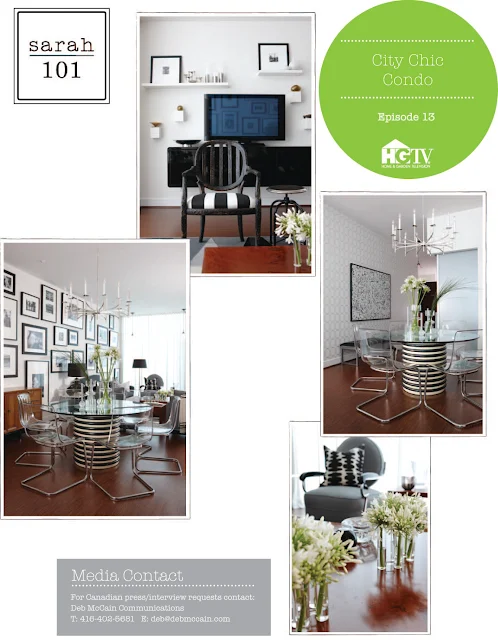
In this week’s episode, Sarah and Tommy take a blank slate of a condo and inject it with a serious sense of style. Starting with the jumping off point – a monochromatic black, white, and grey decorating scheme – Sarah and Tommy mix it up using vintage and modern pieces.
A large round vintage glass table is used to anchor the dining area. The round table is best for a small space; it allows for flow and circulation and provides flexible seating options. Paired with acrylic chairs and a sleek and airy chandelier, the glass table doesn’t feel heavy or too big in this combined living-dining space.
By adding unique and unusual pieces, this builder’s box of a condo gets some personality. Standard potlights are replaced with vintage pendants. Walls are adorned with large-scale DIY artwork and a gallery wall of black and white photos. The combined result is a room which feels collected over time and far from generic.
Tips from the show:
- For professional looking framed photographs, pair ready-made frames with custom-cut mats
- Looking to reupholster a vintage piece? Make sure its sturdy, free of wobbles, and check the original manufacturer’s label as an indication of quality
- Black & white schemes can be harsh and high contrast. Mix them with less severe grey tones.
- The key to a great DIY is knowing what to do yourself and what to hire a pro for (for example, getting a DIY canvas professionally stretched and framed)
- Use black as an accent and not as the main colour in a monochromatic scheme
- Too many black & white fabric patterns can be overpowering. Balance the look with lots of solids.
I think this was my favourite episode of the whole season! It certainly didn’t look like a budget makeover and felt suited to the homeowner. I thought it had just the right mix of vintage and new pieces. What did you think? Did you enjoy the series?


